https://rinnefurlow.com/webdev/project-two/panel-three/index.html
As part of my New Media coursework, I designed and developed a multi-panel website documenting my study abroad experience in Cortona, Italy. This project challenged me to go beyond templates and create a site that was not only visually cohesive and aesthetic, but also technically sound, responsive, and fully customized through CSS and Bootstrap.
A Fully Customized Navigation + Layout
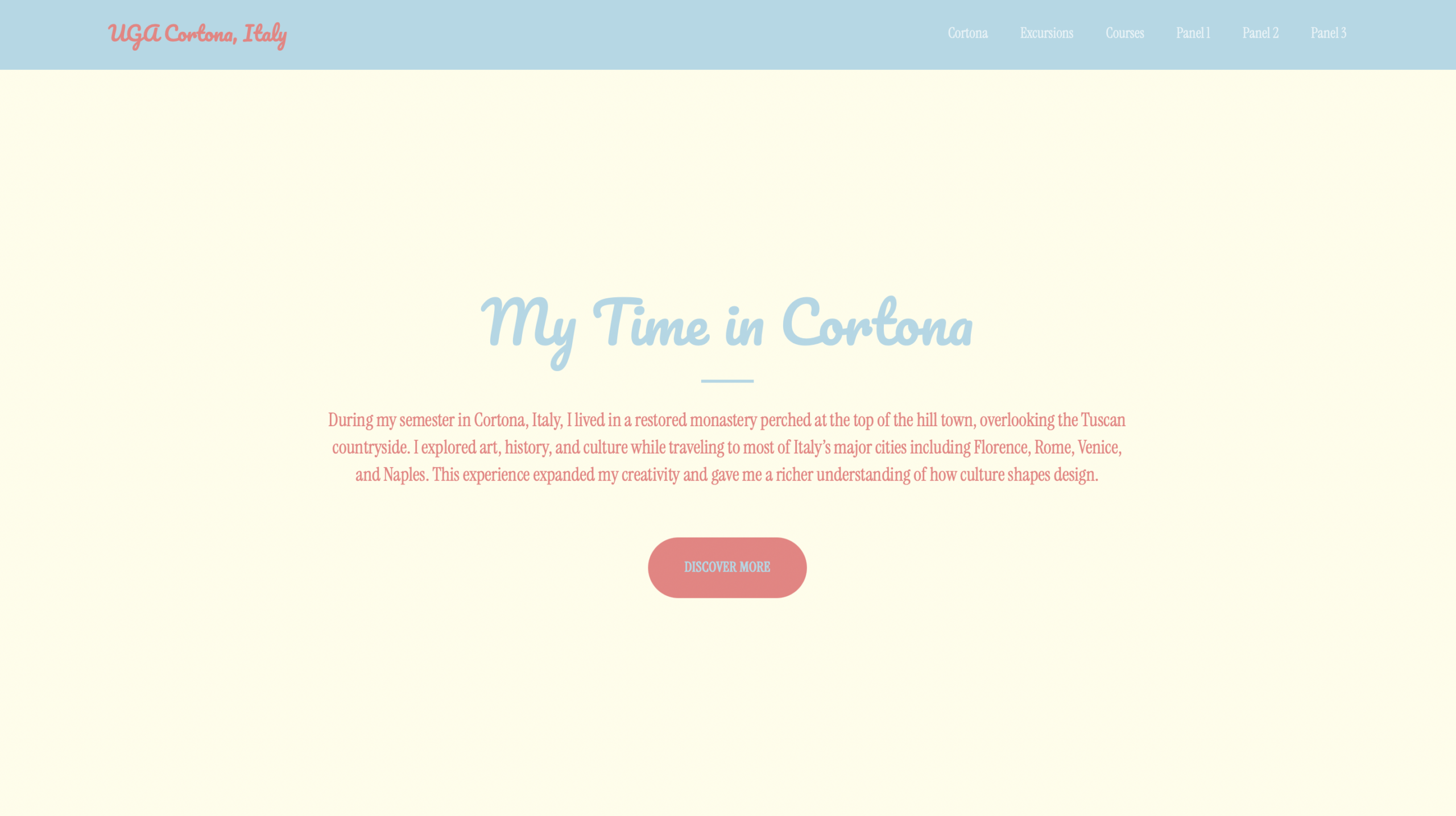
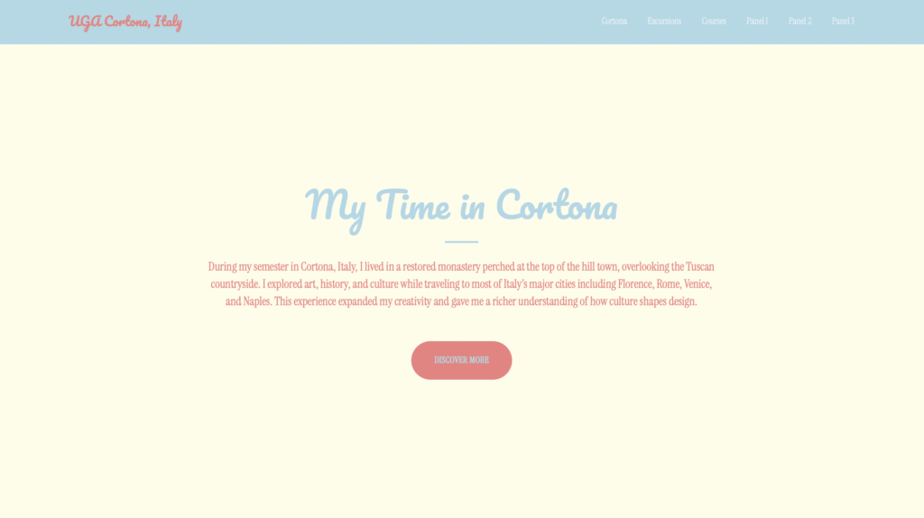
At the top of the site, I built a clean, accessible navbar that included:
- A site title inspired by Italian design elements
- An optional site logo to reinforce the brand identity
- Direct links to all three of the site’s panels
This made it easy to navigate between different aspects of my Cortona experience—from travel photos, to class projects, to reflections.
In the body of the page, I incorporated a button-style link, styled through custom CSS, to lead users to a featured section. This gave the page better visual hierarchy and a more purposeful user flow.
Using the Bootstrap Grid for Multi-Column Layouts
To break up content and create balance, I used horizontal multi-column sections built with the Bootstrap grid. This allowed me to place images and text side-by-side, organize travel galleries, and create a layout that felt modern and editorial rather than static.
Thoughtful Use of Imagery + Typography
The site features several high-quality images from my time in Cortona, all optimized for load speed and displayed responsively so they adjust smoothly across devices.
I also incorporated a non-system Google Font, giving the entire site a unique visual personality that reflects the artistic, colorful atmosphere of the Cortona program.
Responsive Design From the Ground Up
One of the core goals of the project was to create a site that performs just as well on mobile as it does on desktop. I ensured:
- Fully responsive layouts
- Mobile-friendly navigation
- Scalable typography
- Responsive imagery
- Test-driven adjustments at multiple breakpoints
Every panel on the site was built with responsive behavior in mind, making the design adaptable and intuitive.
Custom CSS + Advanced Techniques
All CSS lived in external stylesheets, including a dedicated custom.css file where I wrote all of my customizations.
I went beyond basic edits by:
- Re-styling Bootstrap components
- Overriding theme defaults
- Adding advanced CSS techniques learned from FreeCodeCamp and supplemental resources
- Incorporating transitions, hover effects, and spacing systems
- Creating a cohesive design language carried across all panels
This resulted in a site that clearly moved beyond a stock theme and showcased the full extent of my front-end customization skills.
A Coherent and Aesthetic Design Inspired by Italy
The final website captures the warm, artistic feel of Cortona—from its terracotta tones and narrow streets to its vibrant art studios. Using my background in design and my study-abroad experience, I created a visually consistent site with:
- Harmonized colors
- Balanced spacing
- Clean, readable typography
- Thoughtful content structure